Some of the best colour lessons I've had came from the sofa.
Film and TV are designed frame by frame. Every set, costume and light is chosen to make you feel something before anyone says a word. Stranger Things is a great example. It's set in the 1980s, but it doesn't just copy the decade. It turns the colours up, softens them, or pushes them into darkness depending on the mood of the scene.
So I paused on a few stills and pulled a five-colour palette from each. Here's what I found.
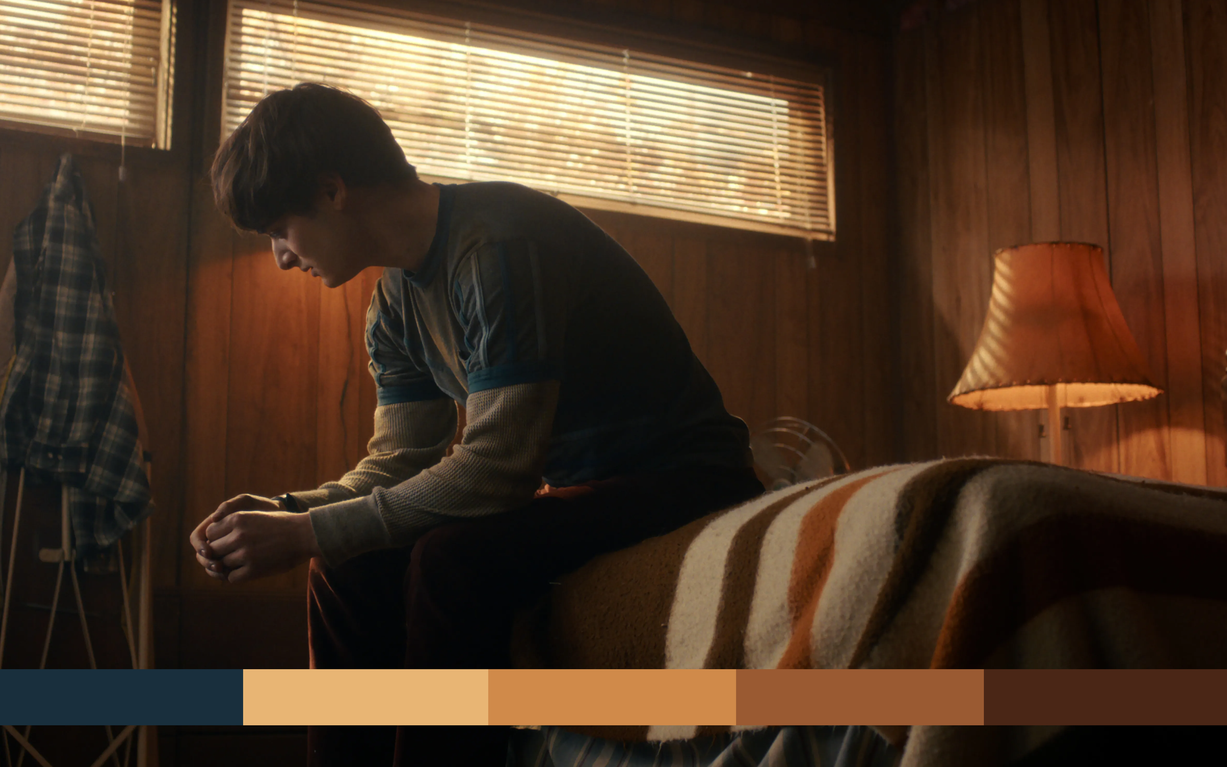
The bedroom
Wood-panelled walls, a striped blanket and afternoon light coming through the blinds. This palette is all warmth: honey, amber, rust and deep brown, with a single cool navy holding it together.
Four warm tones that sit close together feel cosy and nostalgic. The navy is the secret. Without it, the palette would feel muddy. With it, everything else glows.
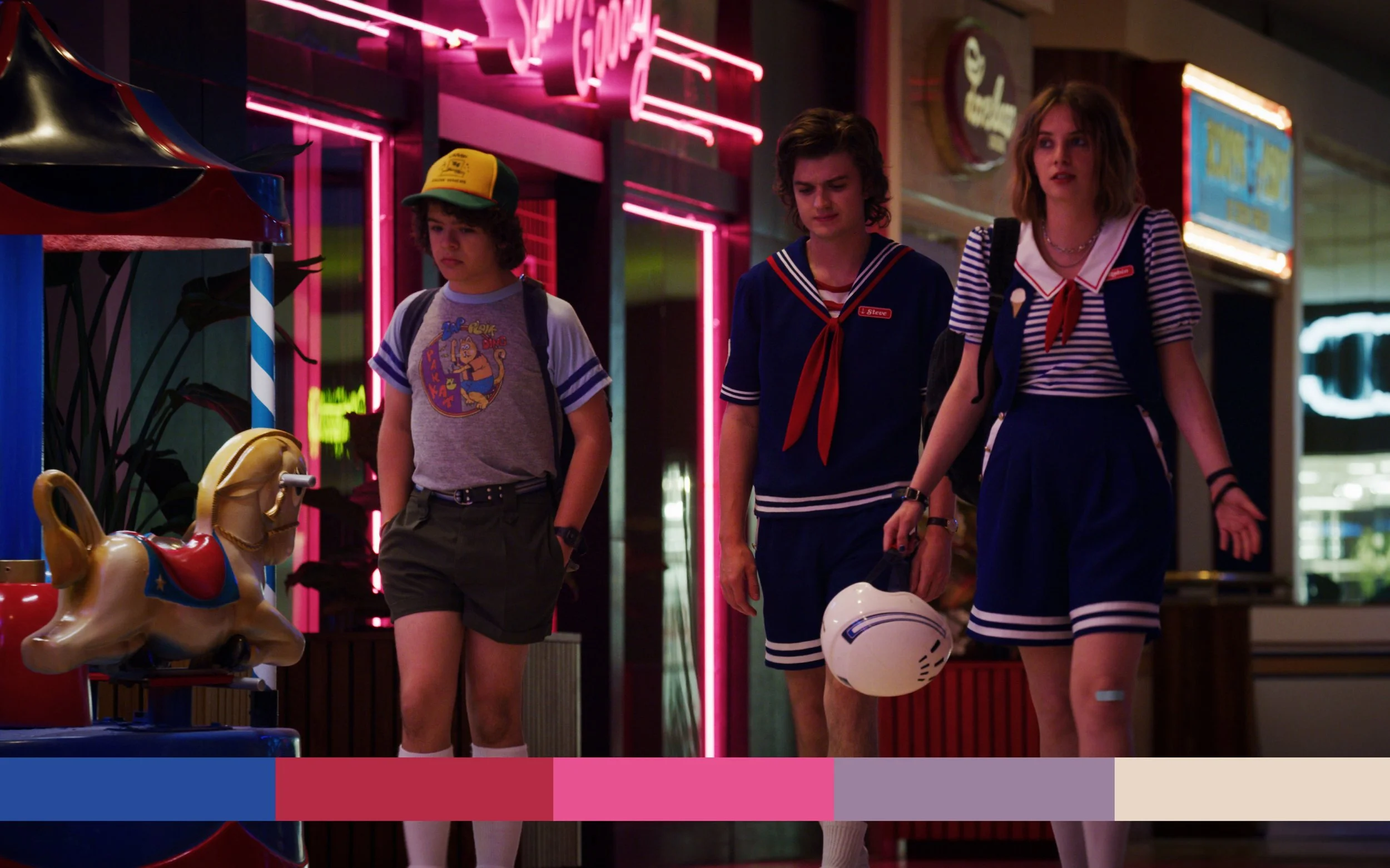
The mall
Neon signs, sailor uniforms and a carousel. This one is pure 80s energy: bright blue, red, hot pink, a dusty lilac and a soft cream.
It's loud, but it isn't random. The blue and red come straight from the uniforms, the pink from the neon. The cream gives your eye somewhere to rest, which is why it feels fun rather than chaotic.
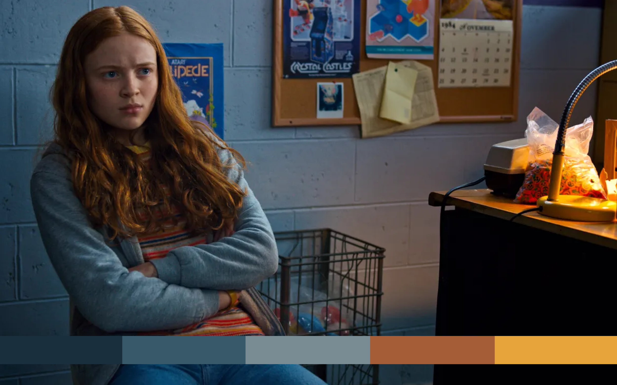
The back room
Painted brick walls, a cork board and a single desk lamp. Mostly cool blue-greys, with one warm burst of orange and gold from the lamp.
Three cool shades set a quiet, slightly tense mood. The warm accents pull your attention exactly where the scene wants it. It's the same trick a brand uses when everything is calm except the button you're meant to press.
